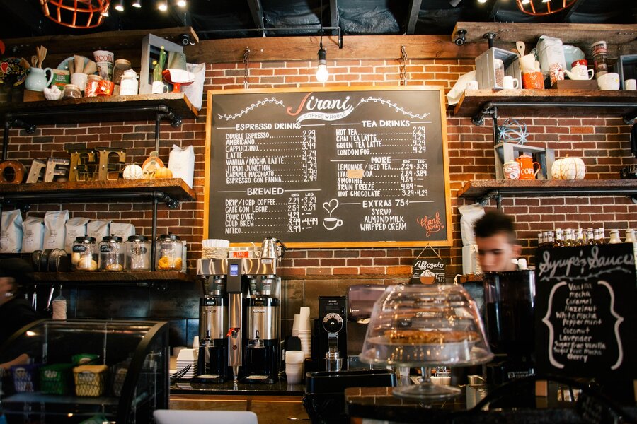
Every link on this site — Home, Generic, Elements, Sign Up, Log In — lives inside one offcanvas panel. There's no breakpoint where it unfolds into an inline navbar; the Menu trigger is the only door in, on a phone or a 4K monitor alike.
Open the MenuThe headline above faded up and blurred into focus once, on page load — pure CSS keyframes, gated behind prefers-reduced-motion, no JavaScript involved at all.
Cyan is the shipped default. Six more palettes — two real sibling variants, four invented — sit one click away behind the same Menu trigger, remembered in localStorage across every page.
This section is that grid: four items, alternating light and dark tint via nth-child, two columns above 980px and one below. You're reading the component it describes.

A photo on one side, copy on the other. Below 980px the whole row stacks full-width, photo on top, text underneath — one breakpoint, no extra markup for the mobile case.
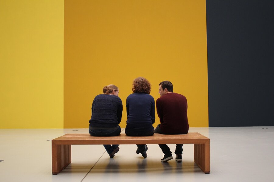
No modifier class, no duplicated markup — :nth-child(2n) alone reverses this row's flex-direction so the photo lands on the right instead of the left.

Odd-numbered, so it's photo-left again. Three rows prove the alternation without repeating past the point of the demo.
Hero, feature grid, three spotlight rows, this band. Two more pages wait behind the Menu — a text-and-photo Generic page, and an Elements page carrying every widget this template ships.