Component Reference
Everything below is real Bootstrap 5 markup — type, lists, tables, buttons, forms, images — restyled with Canvas's classes and colors. Submitting the form does nothing; this page is a reference sheet, not a working page.
Two Halves, One Row
col-md-6 twice makes the classic half-and-half split — each column drops to full width below the md breakpoint (768px) and stacks instead of squeezing.
Same Split, Mirrored
This column is identical markup to its neighbor — col-md-6 doesn't care which half it's in, only that two of them add up to twelve.
Three Across at lg
col-lg-4 × 3 makes a three-up row from 992px up. Below that it's col-md-12 — one column, stacked, same as the pair above.
gy-4 for Vertical Gutters
The wrapping row uses gy-4 instead of a full g-4 — vertical gutters between stacked rows, no horizontal gutter needed since the columns already fill the width.
Five Boxes, One Pattern
Two halves above, three thirds below — both rows share the same spacing rules, just different column counts.
Elements
Text
This is bold and this is strong. This is italic and this is emphasized.
This is superscript text and this is subscript text.
This is underlined and this is code: for (;;) { ... }.
Finally, this is a link.
Heading Level 2
Heading Level 3
Heading Level 4
Heading Level 5
Heading Level 6
Heading with a Subtitle
A plain header wraps a heading and a paragraph — no special class, just two elements stacked
This is the <h2> weight of the pattern — the same two-element header used atop this whole section, just demonstrated inline so you can see it without scrolling back up.
Heading with a Subtitle
One level down, same wrapper
The <h3> weight works for a subsection inside a longer article — smaller than the section-level heading above, still paired with its own subtitle line rather than standing alone.
Heading with a Subtitle
Smallest tier of the same pattern
And <h4> for a subsection within a subsection — three sizes of the identical two-element pattern, chosen by how deep the content nests.
Lists
Unordered
- Default browser bullets, spacing from theme.css.
- Three items is enough to show the rhythm.
- Nested lists would inherit the same rules.
Alternate
- list-plain strips the bullets entirely.
- Each item gets a top border instead.
- Good for a compact link list or spec sheet.
Ordered
- Numbers come from the browser, not Bootstrap.
- Six items here just to show the counter continuing.
- Same spacing rules as the unordered list above.
- No line-height overrides beyond the theme default.
- Nest an ol inside an li and it re-indents automatically.
- That's every list variant this template ships.
Icons
Definition
- Item 1
-
Default
<dl>markup — term and definition, no custom classes applied. Three pairs is enough to show the rhythm without padding the page. - Item 2
-
Each
<dt>/<dd>pair inherits the same paragraph spacing as body copy — no specialdlstyling exists in theme.css for this template. - Item 3
-
A good fit for a spec sheet or FAQ; swap the terms and definitions for real content.
Actions
Blockquote
A blockquote here gets a 4px neutral left border and italic type — this line runs long enough to wrap onto a second line so you can see the indent hold there too, not just on the opening line.
Table
Default
| Name | Description | Price |
|---|---|---|
| Item 1 | Base row style: padding, top and bottom border, no fill. | 29.99 |
| Item 2 | Zebra striping via tbody tr:nth-child(2n+1). | 19.99 |
| Item 3 | Header row is bold with a 2px bottom border, no fill. | 29.99 |
| Item 4 | Footer row totals the column, 2px top border. | 19.99 |
| Item 5 | table-wrapper adds overflow-x: auto, so a wide table scrolls instead of breaking the layout. | 29.99 |
| 100.00 | ||
Alternate
| Name | Description | Price |
|---|---|---|
| Item 1 | table-canvas-alt adds a full grid of borders. | 29.99 |
| Item 2 | border-collapse: separate keeps corners crisp. | 19.99 |
| Item 3 | No zebra striping in this variant. | 29.99 |
| Item 4 | Same markup as Default, one modifier class added. | 19.99 |
| Item 5 | Footer row keeps its top border, drops the bottom. | 29.99 |
| 100.00 | ||
Buttons
Form
Image
Fit
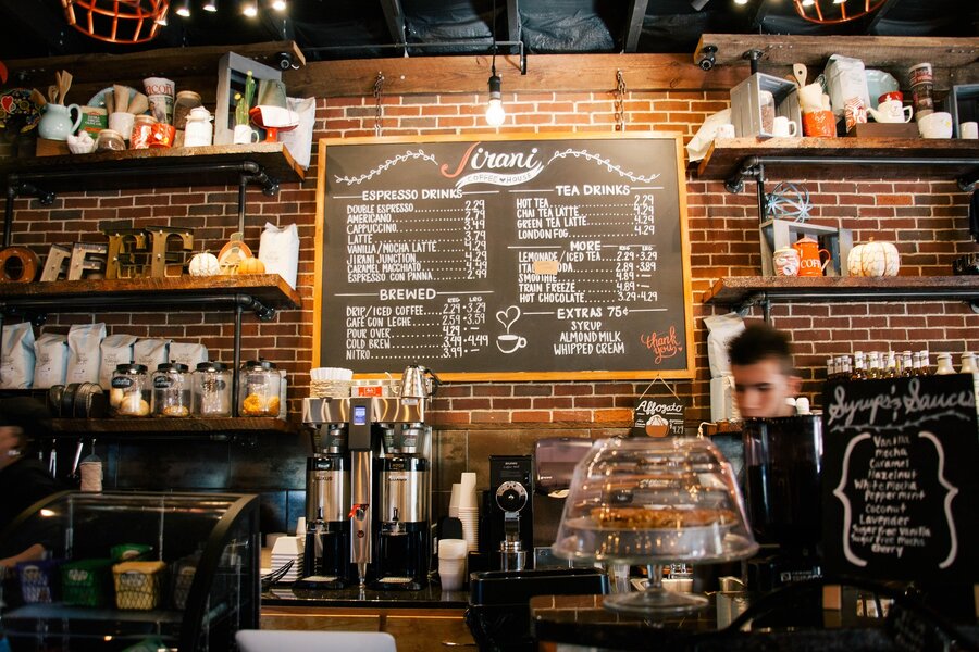
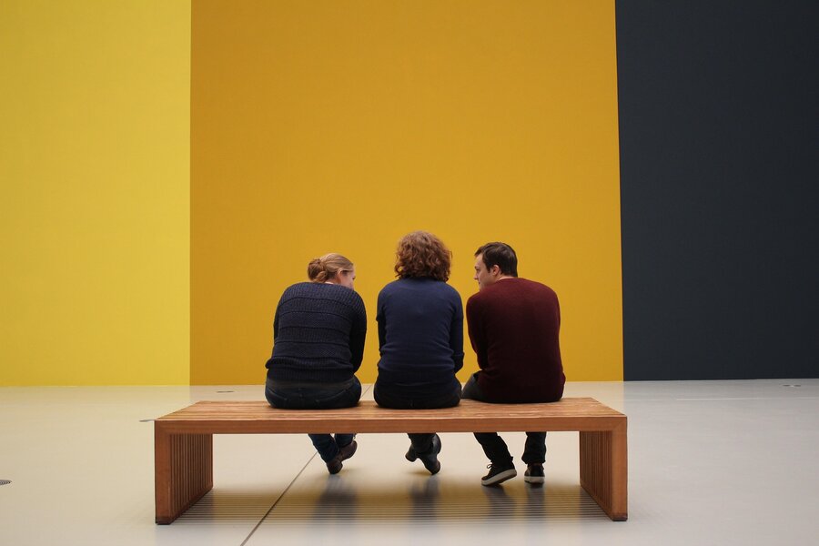

Left & Right
This paragraph demonstrates figure-inline-left on a rounded, 40%-width image — text wraps around its right edge once the float clears. Long-form article bodies use this pattern for a lead image, a pull photo, or an inline diagram without breaking the reading column into a grid. The image keeps floating until the paragraph runs out of text tall enough to wrap beside it, and normal block flow resumes below once it does. Swap the class to figure-inline-right and the same pattern mirrors to the right, which is exactly what the next paragraph does.
This is the mirror of the paragraph above: figure-inline-right pulls the photo to the right edge instead, and text wraps along its left side. Alternating figure-inline-left and figure-inline-right between paragraphs is a common pattern for photo-heavy articles — it breaks up a column of text without resorting to a full image grid, and reads naturally whichever side the image lands on. Both floats clear at the end of their own paragraph, so the next block starts fresh at full width.
Box
content-box wraps copy in a bordered, padded card — 1px border, 4px radius, 1.5em padding, no background fill. content-box-flush strips the border and padding entirely, which is what the Fit image grid above uses to butt its tiles together without a frame around the whole group.
Preformatted
i = 0;

while (!deck.isInOrder()) {
    print 'Iteration ' + i;
    deck.shuffle();
    i++;
}

print 'It took ' + i + ' iterations to sort the deck.';