One Column, No Chrome
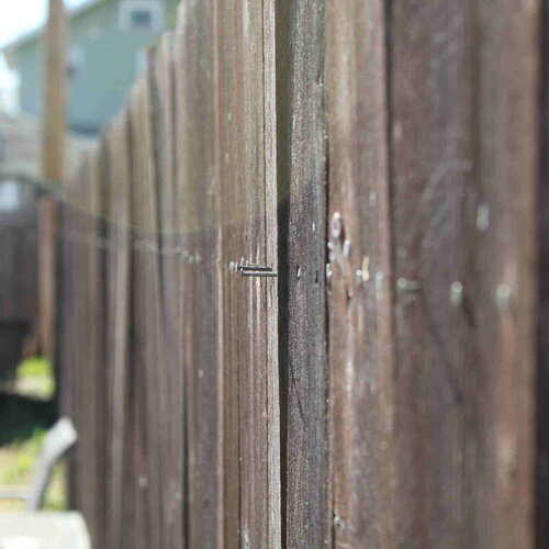
This is the page every template needs and nobody looks at twice: a title, a photo, and a column of text. No sidebar, no grid, no card. content-section centers a content-section-inner up to 75em wide — the same wrapper the home page's spotlight rows and CTA band both use, one class reused everywhere a section needs consistent side padding.
The photo on the left is a figure-inline-left — float: left, capped at 40% width, with a right margin so text wraps around it instead of stacking below. Its mirror, figure-inline-right, shows up twice on the Elements page floating the other way. Both clear at the end of their own paragraph; whatever comes next starts fresh at full width.
Same Header, No Animation
The photo banner above uses the identical background-image and dark gradient overlay as the home page's hero — the same trick that keeps white type legible over a bright photo — but without the load-in reveal keyframes. Static content gets a static header; only the homepage's first paint earns the fade.
Two more pages exist behind the Menu: the homepage itself, and Elements, which carries every widget this template ships — type, lists, tables, buttons, forms, images — laid out for reference rather than narrative.