Mosaic
Four things this page shows off
This section pairs a text panel with a plain <ul> icon grid — no cards, no JS, just a bordered list that wraps at 50% width per item. The four tiles double as a table of contents for the template's core pieces.
-
Spotlight Panels
-
Tri-Accent Theme
-
Nested Dropdown
-
Off-canvas Nav
Reversed, tinted, and a real <img>
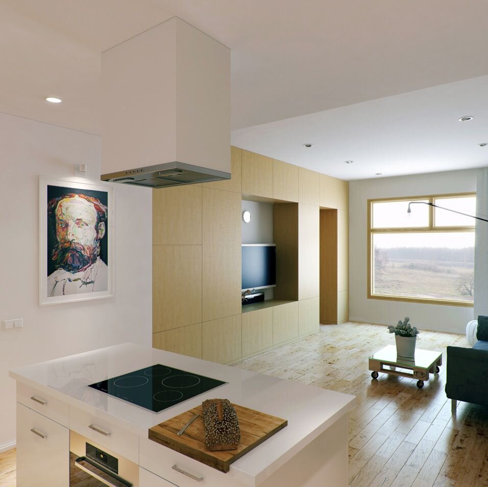
content-section-spotlight-reversed flips the flex row so the image leads on desktop. tone-accent-1 tints this panel with the first of the three accent custom properties. The photo is a visible <img>, not a CSS background — crop it with an object-position utility instead of fighting background-position math. Here that's spotlight-media-focus-upper-left.
Second accent, image anchored right
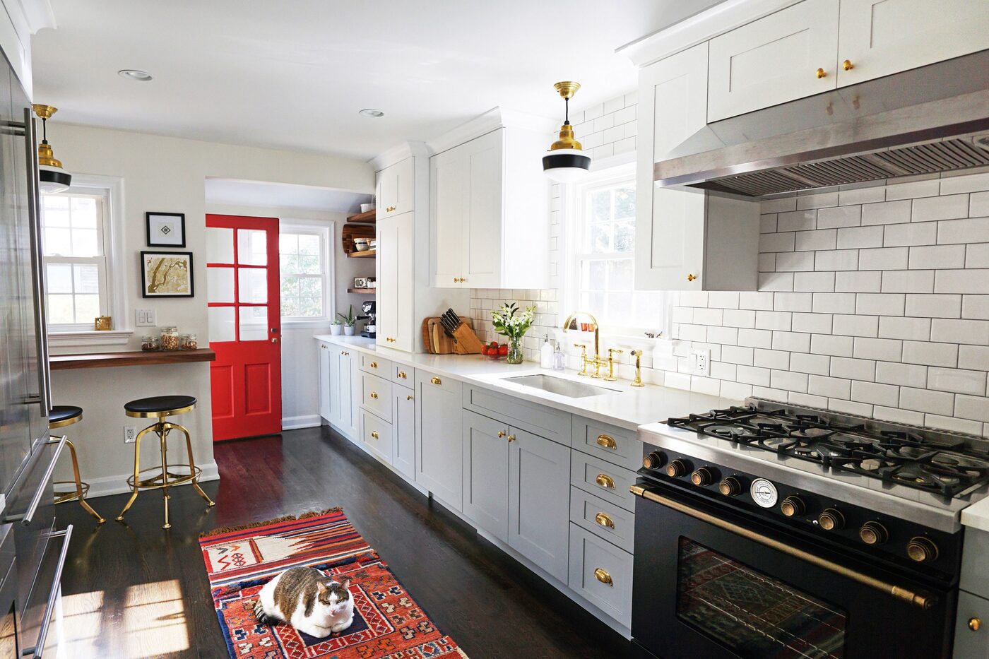
No reversed class here — content stays left, image stays right, same as the source order in the HTML. tone-accent-2 swaps in the second accent property, and spotlight-media-focus-right sets object-position: center right, useful when a photo's subject sits off-center instead of dead center.
Third accent, cropped to the top-right
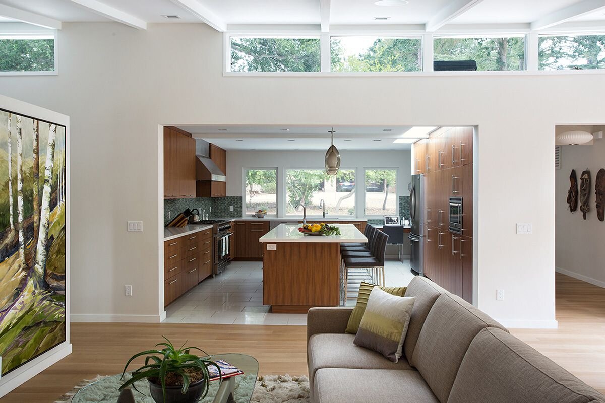
Reversed again, this time on tone-accent-3 — the third and last of the accent triad. spotlight-media-focus-top-right anchors the crop toward the top-right corner of the frame, the same object-position trick as the other two spotlights with a different anchor point.
What people are saying
These three quotes were written for this demo — nobody has actually said them about Mosaic. They stand in for wherever real feedback will eventually go.
-

Priya Nakamura
Freelance web designer — sample quote“The tri-accent theme switcher sold me. I renamed three hex values in one file and had a client-matched palette in ten minutes.”
-

Devon Marsh
Front-end contractor — sample quote“Swapping backgrounds for real <img> tags in the spotlight panels made cropping so much easier — object-position instead of background-position math.”
-

Marcus Ferreira
Small studio owner — sample quote“The nested dropdown and the off-canvas panel both worked first try on my phone. That's rarer than it should be.”