Elements
Every typography, list, table, button, form, and image class Mosaic ships with, each demonstrated on its own.
Text
Inline text elements, a blockquote, and a preformatted code block — all unstyled beyond Mosaic's base typography.
This is bold and this is strong. This is italic and this is emphasized.
This is superscript text and this is subscript text.
This is underlined and this is code: for (;;) { ... }. Finally, this is a link.
Blockquote
A blockquote for pulled quotes, sidebar callouts, or — as here — explaining what a blockquote is for: setting a sentence apart from the paragraphs around it with an indent and a left rule instead of a change in type size.
Preformatted
i = 0;

while (!deck.isInOrder()) {
    print 'Iteration ' + i;
    deck.shuffle();
    i++;
}

print 'It took ' + i + ' iterations to sort the deck.';
Lists
Unordered, alternate (borderless with top rules), and ordered lists, plus the icon-link row and the four button-row layouts used throughout the template.
Unordered
- Bootstrap 5.3 core
- Font Awesome 7 solid icons
- Vendored Source Sans Pro
Alternate
- No build step
- No jQuery
- Every asset local
Actions
Table
Two table skins sharing the same markup — table-mosaic for the border treatment, plus table-mosaic-alt for zebra striping. Both are filled with this template's own vendored assets, sized on disk.
Default
| Asset | Purpose | Size (KB) |
|---|---|---|
| bootstrap.min.css | Grid, components, utilities — vendored, unmodified. | 227 |
| theme.css | Palette, layout, and the tri-accent theme switcher. | 22 |
| main.js | Dropdown submenu, off-canvas nav, theme swatches. | 5 |
| source-sans-pro.css | Local @font-face — no Google Fonts request. | 5 |
| fontawesome + solid + brands | Icon set — solid.min.css only, never all.min.css. | 87 |
| 346 | ||
Alternate
| Asset | Purpose | Size (KB) |
|---|---|---|
| bootstrap.min.css | Grid, components, utilities — vendored, unmodified. | 227 |
| theme.css | Palette, layout, and the tri-accent theme switcher. | 22 |
| main.js | Dropdown submenu, off-canvas nav, theme swatches. | 5 |
| source-sans-pro.css | Local @font-face — no Google Fonts request. | 5 |
| fontawesome + solid + brands | Icon set — solid.min.css only, never all.min.css. | 87 |
| 346 | ||
Form
A contact-style form using Bootstrap's form-control, form-select, and form-check, restyled through the accent custom properties instead of Bootstrap's default blue focus ring.
Image
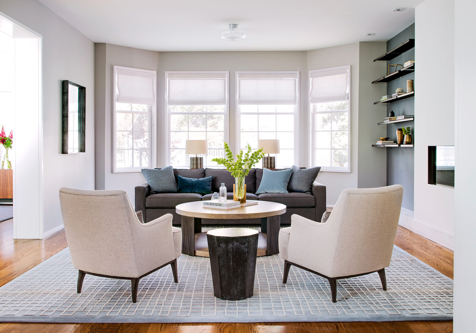
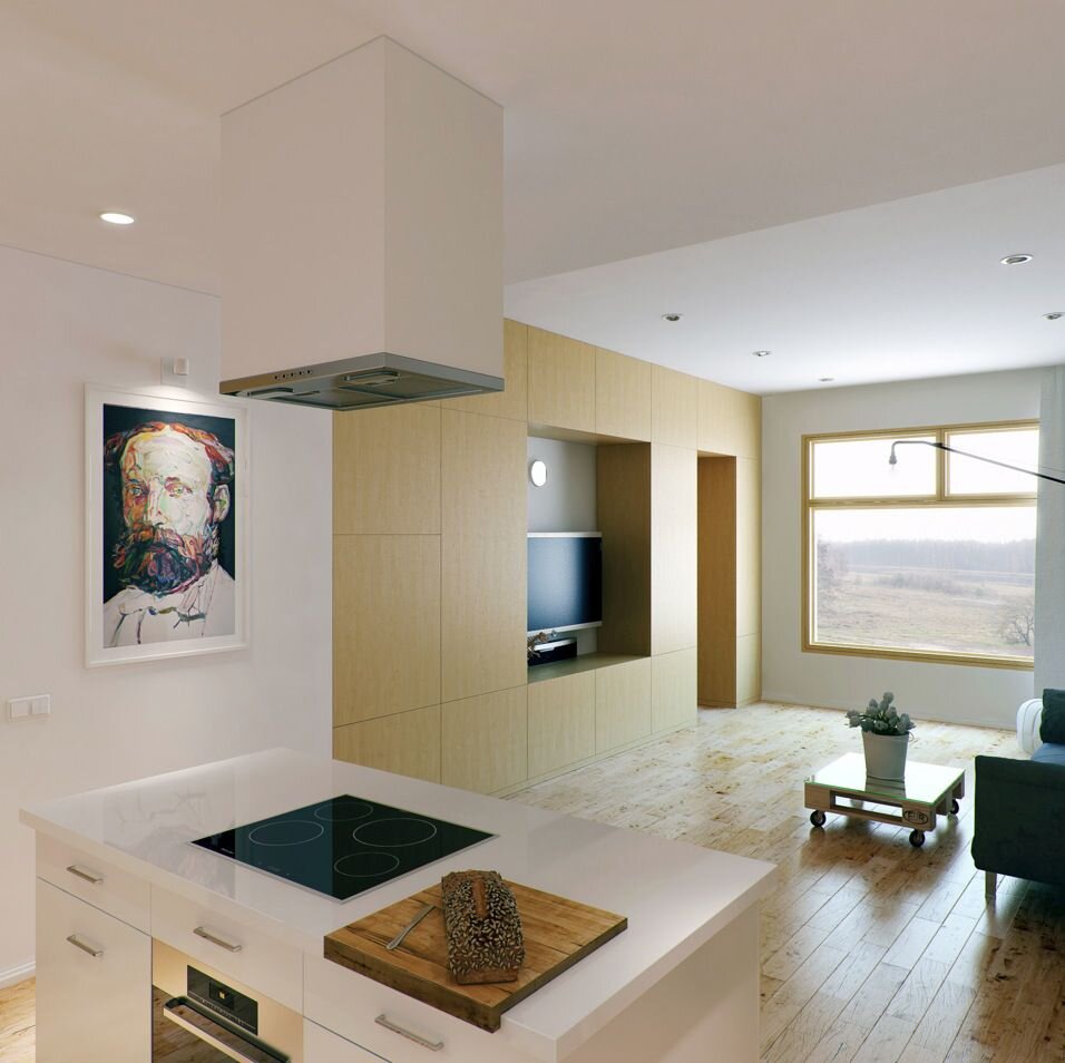
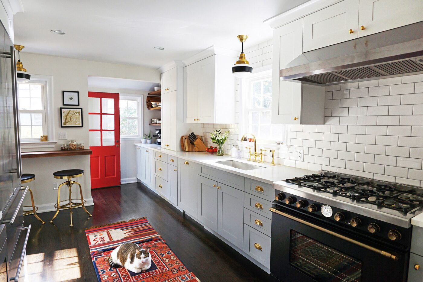
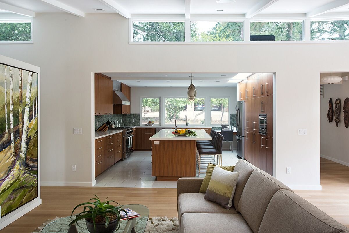
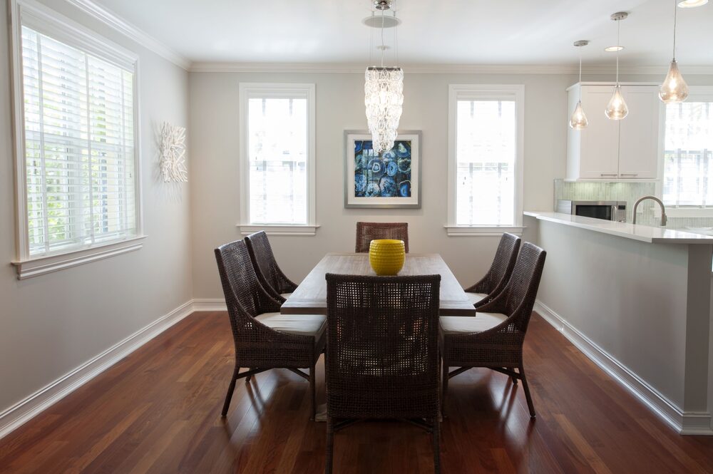
Three image-fit utilities: fit-photo for uniform grid cells (object-fit: cover), and inline-photo-start / inline-photo-end for floated images inside a paragraph.
Fit
Left & Right

inline-photo-start floats the image left with margin on the right and bottom, so text wraps around it the way an image floated inside a rich-text editor's output would. The class caps width at 40% of the paragraph's column so a tall photo never crowds out the copy beside it. This paragraph exists to prove the wrap holds for more than a couple of lines — which it does, all the way down through several sentences of real running text, past the point where most float bugs would already have shown themselves, and it still reads cleanly beside the photo without the layout collapsing or the image dropping below the fold. Clear the float on whatever element comes after this paragraph and the next section starts clean, unaffected by anything above it.

inline-photo-end is the mirror image of the class above — same 40% cap, same margin, just flipped to the right side with the spacing on the left and bottom instead. It exists because plenty of layouts want the photo on the opposite side of the text, and duplicating a float class with one property changed is simpler than trying to make a single class handle both directions through a modifier. Both classes share the same border-radius as every other photo in the template, so a floated image never looks like it belongs to a different component than the lead photo or the fit-photo grid above.