One centered message, one icon, one paragraph.
This is the feature-major block — a bookend section, centered and padded wide (6em on each side at desktop, full width on phones), meant to open or close a page with a single idea instead of a grid. Section Four below reuses this same class to close the homepage with a call to action.
Text beside a grid,
the classic 4/8 split.
col-md-4 holds the pitch: a heading, a paragraph, one ghost button. col-md-8 holds a six-item icon grid — two columns on phones, three from the sm breakpoint up via row-cols-2 row-cols-sm-3. It's one plain <ul>, no card markup. Swap the six icons for whatever your six things are.
-
Two cols on phones
-
Three from sm up
-
Plain list, no cards
-
Border-only icon ring
-
Center-aligned by default
-
Six items, swap freely
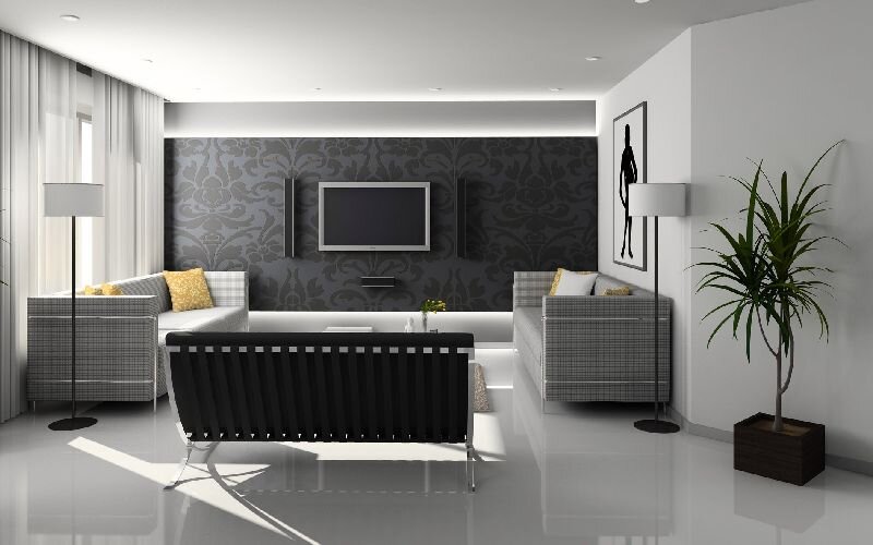
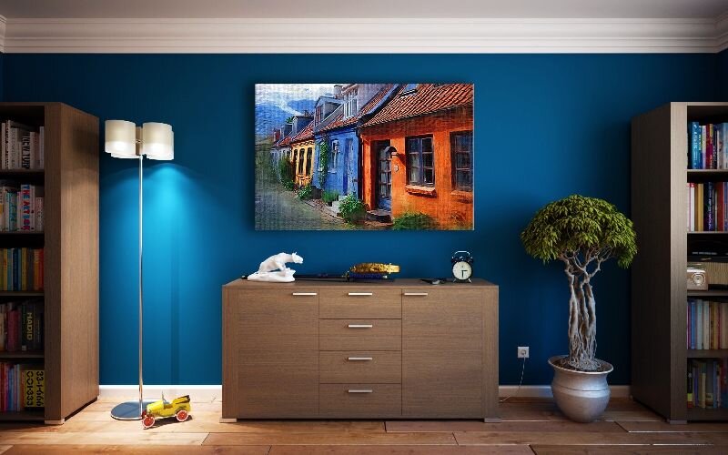
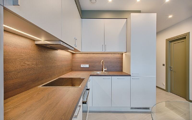
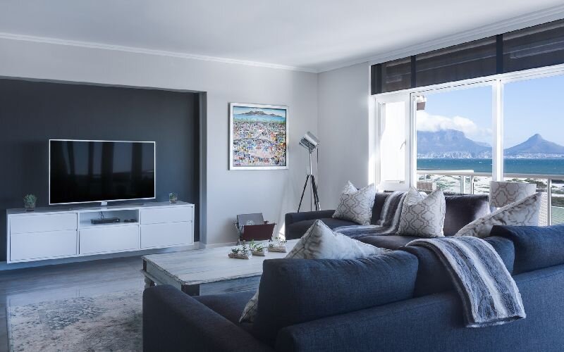
Order utilities flip
the reading sequence.
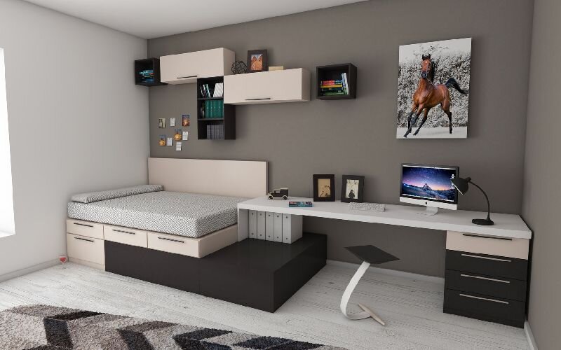
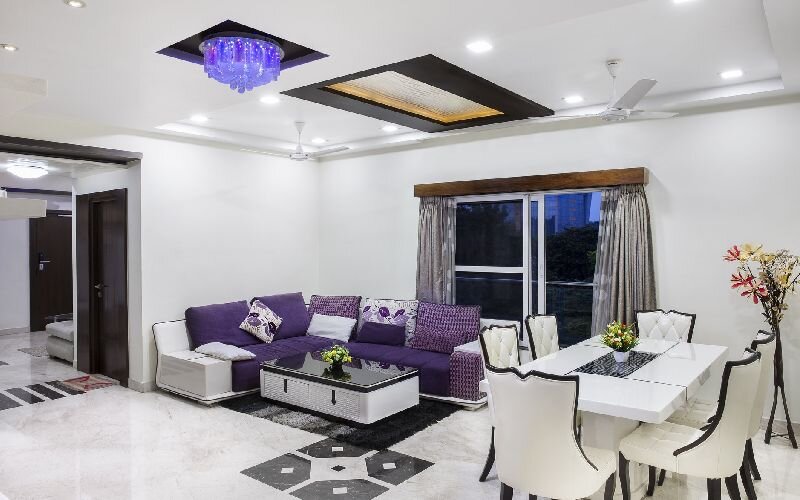
On phones this text block leads (.order-first) so the pitch lands before six images load. From md up, the image grid takes the lead (.order-md-1) and this column drops to second (.order-md-2) — the same two columns, reordered by breakpoint alone, no markup duplicated.
The six tiles are uniform 800×500 photos, captioned in an overlay strip along the bottom edge — the pattern most portfolios and case-study grids use.
That's the whole homepage.
Hero, two split sections, an image grid — four blocks, one footer. Four layouts wait past this button: left rail, right rail, no rail, and a contact form. The Elements page has everything else — type, tables, forms, buttons, images.