Elements
Every demo widget on this page, restyled with Bootstrap 5 utilities — still fully functional
Text
This is bold and this is strong. This is italic and this is emphasized.
This is superscript text and this is subscript text.
This is underlined and this is code: for (;;) { ... }. Finally, this is a link.
Heading with a Subtitle
The .section-heading wrapper pairs a heading with a muted subtitle line
A negative top margin on the subtitle (see .section-heading p in theme.css) pulls it snug against the heading above, so the pair reads as one unit instead of two stacked elements. This is the <h3> weight — the same pattern the page headers use throughout this template, just sized for use inside a section rather than at the top of a page.
Heading with a Subtitle
Same wrapper, one level down
The <h4> weight of the same pattern works for a subsection inside a longer article — smaller than the page-level heading above, but still paired with its own muted subtitle line rather than standing alone.
Heading Level 2
Heading Level 3
Heading Level 4
Heading Level 5
Heading Level 6
Blockquote
A blockquote gets a 4px accent-toned left border and italic type — this line runs long enough to wrap onto a second line so you can see the indent hold there too, not just on the first.
Preformatted
i = 0;

while (!deck.isInOrder()) {
print 'Iteration ' + i;
deck.shuffle();
i++;
}

print 'It took ' + i + ' iterations to sort the deck.';
Lists
Unordered
- Default browser bullets, no Bootstrap classes.
- Line height and spacing come from theme.css.
- Nested lists inherit the same type styles.
Alternate
- list-unstyled strips the bullets and padding.
- Each item adds its own border-top py-2 divider.
- A good pattern for a compact link list.
Ordered
- Numbers come from the browser, not Bootstrap.
- Six items here just to show the counter continuing.
- Same spacing rules as the unordered list above.
- No line-height overrides beyond the theme default.
- Nest an ol inside an li and it re-indents automatically.
- That's every list variant this template ships.
Icons
Actions
Table
Default
| Name | Description | Price |
|---|---|---|
| Item 1 | Base row style, no border, generous padding. | 29.99 |
| Item 2 | Zebra-striped body via nth-child(2n+1). | 19.99 |
| Item 3 | Right-aligned numbers, left-aligned text. | 29.99 |
| Item 4 | Header row in --ink, no background fill. | 19.99 |
| Item 5 | Base row style, no border, generous padding. | 29.99 |
| 100.00 | ||
Alternate
| Name | Description | Price |
|---|---|---|
| Item 1 | Base row style, no border, generous padding. | 29.99 |
| Item 2 | Zebra-striped body via nth-child(2n+1). | 19.99 |
| Item 3 | Right-aligned numbers, left-aligned text. | 29.99 |
| Item 4 | Header row in --ink, no background fill. | 19.99 |
| Item 5 | Base row style, no border, generous padding. | 29.99 |
| 100.00 | ||
Buttons
- Accent
- Default
Form
Image
Fit
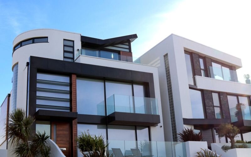
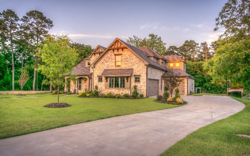
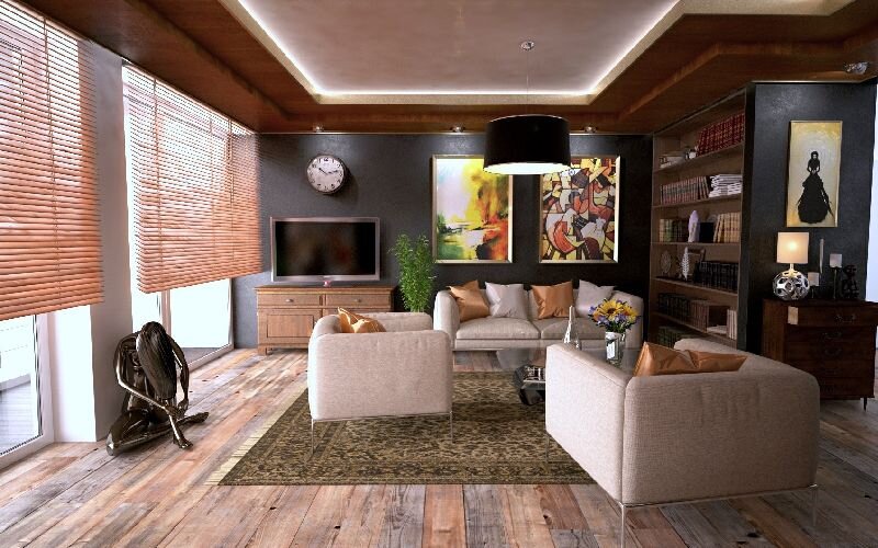
Left & Right
 This paragraph demonstrates
 float-start on a rounded, quarter-width image — text wraps around its right edge once the float clears. Long-form article bodies use this pattern for a lead image, a pull photo, or an inline diagram without breaking the reading column into a grid. The image keeps floating until the paragraph runs out of text tall enough to wrap beside it, and normal block flow resumes below once it does. Swap the class to float-end and the same pattern mirrors to the right, which is exactly what the next paragraph does.
 This is the mirror of the paragraph above:
 float-end pulls the photo to the right edge instead, and text wraps along its left side. Alternating float-start and float-end between paragraphs is a common pattern for photo-heavy articles — it breaks up a column of text without resorting to a full image grid, and reads naturally whichever side the image lands on. Both floats clear at the end of their own paragraph, so the next block starts fresh at full width.