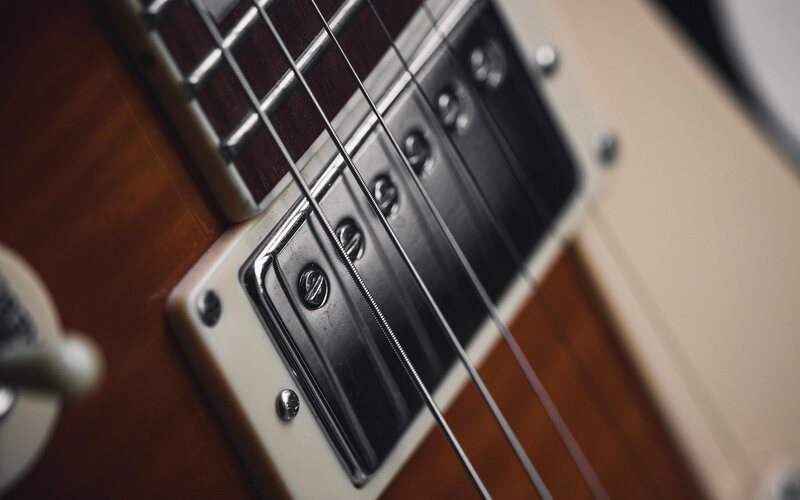
Equal-height cards
display: flex; flex-direction: column on .post-card, then flex-grow: 1 on the body — six cards in a row-cols grid end up the same height no matter how long each excerpt runs.
col-lg-4 carries the pitch, col-lg-8 carries a single large photo — no grid, no cards, just a wide image doing the talking. Swap the copy and the picture and this pattern works as a feature callout, a case-study lead-in, or, like right here, an explanation of itself.

Each .icon-badge is a plain <span> clipped into a hexagon with CSS clip-path: polygon(...) — no SVG file, no icon sprite sheet, just a colored box and a Font Awesome glyph centered inside it.
row-cols-md-3 lays out three even columns; a 1px left border on every column but the first is what turns into the vertical rules you see splitting them apart on desktop.
Below the md breakpoint the divider becomes a top border instead of a left one — row-cols-1 stacks the three columns and the rule reads top-to-bottom instead of side-to-side.
display: flex; flex-direction: column on .post-card, then flex-grow: 1 on the body — six cards in a row-cols grid end up the same height no matter how long each excerpt runs.

flex-grow: 1 on the paragraph pushes the "More" button to the bottom of every card, even the short ones — the button row never floats mid-card.

row-cols-1 row-cols-lg-2 row-cols-xl-3 — one card per row on phones, two on laptops, three on wide desktops, the same six <article>s throughout.

.post-card-image and .post-card-body live inside a plain 1px border — no box-shadow, no rounded corners, the same flat, square language the buttons and badges use.
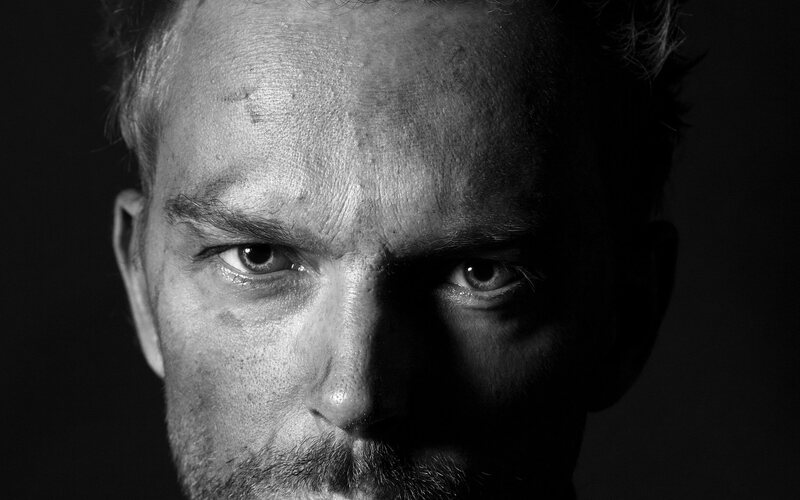
Each thumbnail is a plain <img class="w-100"> — width scales to the column, height follows the photo's own aspect ratio, nothing is force-cropped with object-fit.

The whole grid sits inside .page-section-alt — the same off-white background band the contact section below uses, so the two sections pair visually without a hard edge between them.
(800) 555-0000
1234 Placeholder Avenue
Nashville, TN 00000
United States